
Introduction
Overview
Courts is well known throughout the Caribbean, and its name is synonymous with quality, affordable, furniture and appliances, flexible credit options as well as innovative marketing promotions. The company has been a market leader since its inception and its bright yellow, red and blue buildings dominate major towns across the many Caribbean islands.
Challenge
Due to Courts being the market leader the traffic to the physical store was high, and follow-up purchases were low. They needed a digital solution with an increase in conversion rate on all digital platforms. The mobile app needed to remain consistent with the established design guidelines from the website.
Role: UX designer
Platform: Mobile Application [IOS]
Timeline: 2 weeks.
Approach
User Interviews
Contextual Research
Heuristic Evaluation
Usability Testing
Result
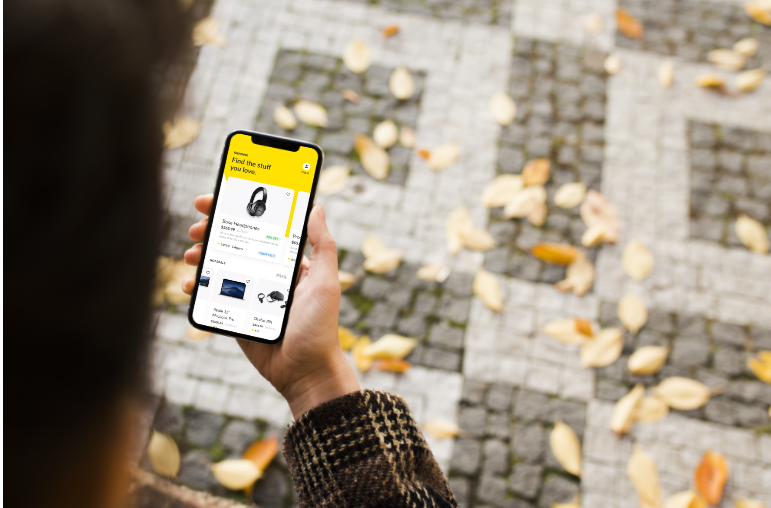
An interactive mobile friendly prototype which included dozens of implementations of insights found during research and solutions to speed up and improve the interaction. The mobile allows users shop for their favorite items as they would with ease and convenience from anywhere.
The Process
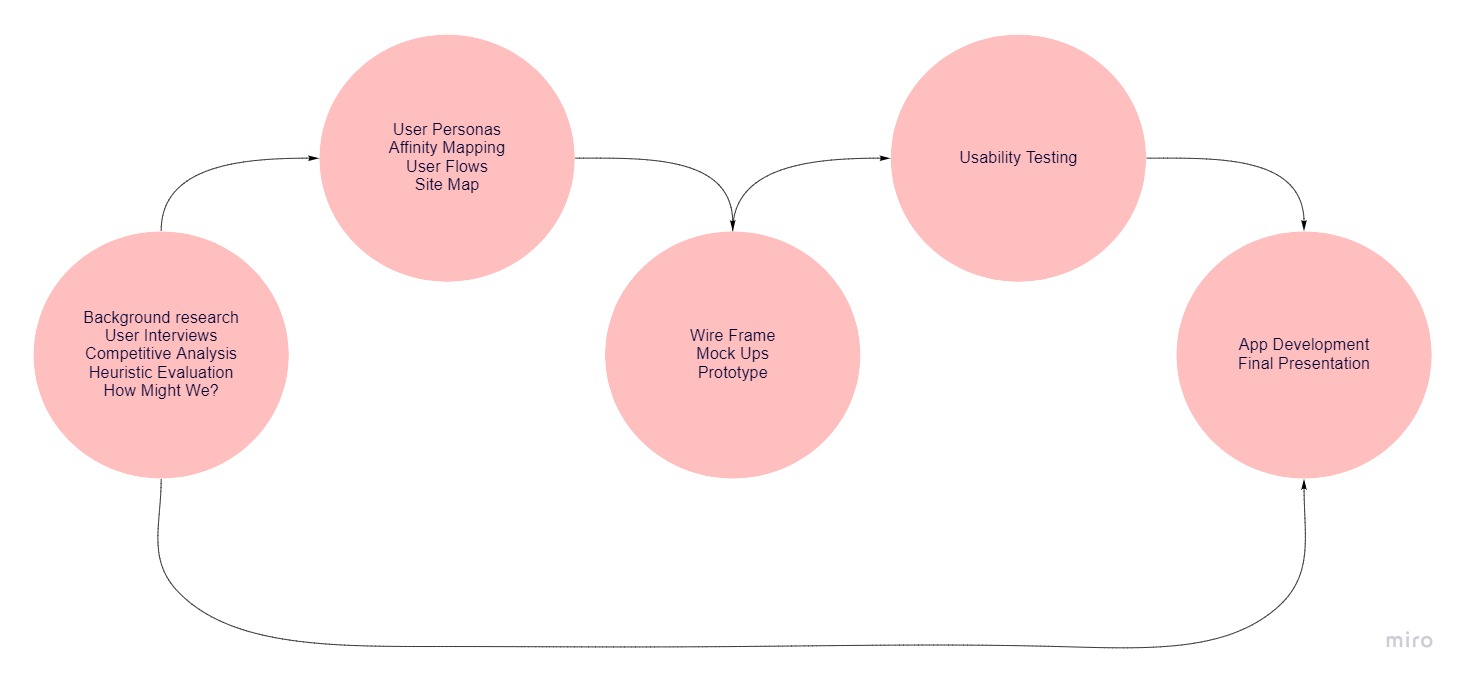
DISCOVER
Through contextual research, user interviews and competitive analysis with similar applications on the market; we were able to gather insights into shopping habits and behaviors and understanding what users might expect and how the mobile app could improve on that.
Consumers are increasingly shopping online on platforms such as Amazon, ASOS, IKEA for their shopping fix. Even big companies as ZARA, SHEIN, H&M have developed online shops and e-commerce apps, making the market even more competitive.
Based on this setting, 3 mobile apps were picked to research: IKEA, Amazon and ASOS in our effort to build a better shopping experience.
Based on competitive analysis the main issues we discovered were related to the most important features of an e-commerce app, they selected based on these 3 qualities:
- Being a retailer with global coverage.
- Having an ecommerce mobile app.
- Having similar product offerings.
The Key findings were:
- Most shoppers are not aware of the apps’ existence or do not use them.
- The brand is not visible enough.
- Navigation is done through a side-menu.
How Might We?
At the start of the project, three main questions were in mind. How might we:
- improve the shopping experience?
- improve the checkout experience?
- adopt mobile payment?
Improve the shopping experience by implementing the in-store environment in the ecommerce app.
First, we define the unique experience at a physical store so we can adapt it to the mobile app.
- Big images, bright lights, neatly stacked shelves.
- Sales and promotions throughout the year for different products.
- Easy to find the right product without the help of a sales assistant.
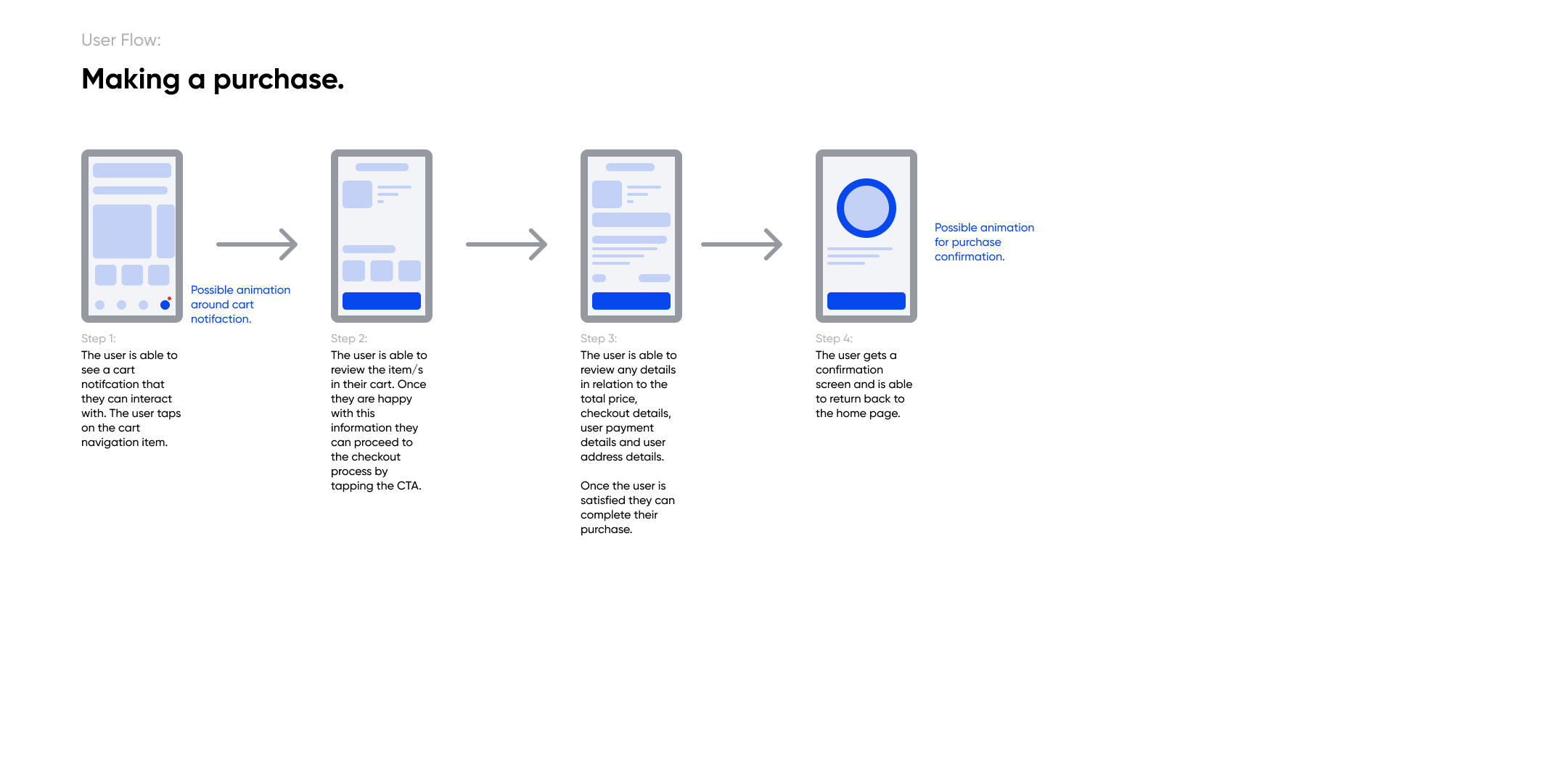
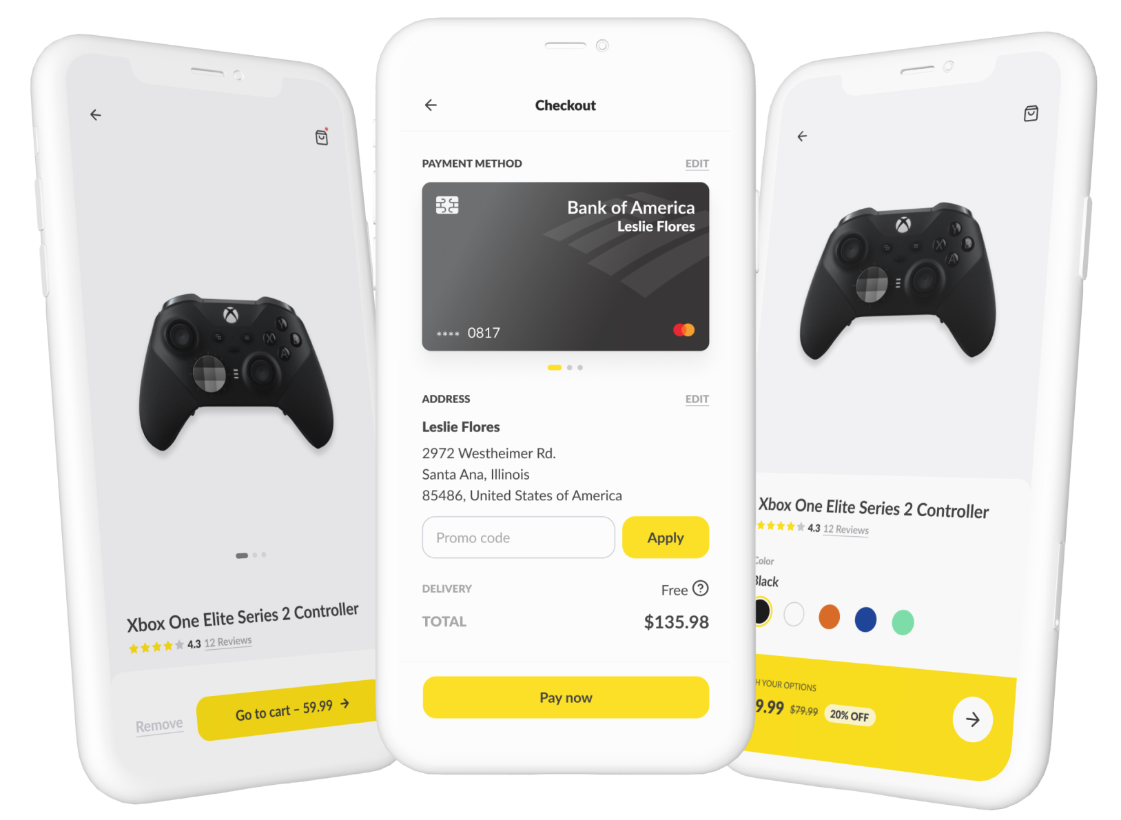
Improve the checkout experience by creating a straightforward experience.
- Adding products to cart is clear.
- Billing has the option to add an address (or to use the existing one), shipping gets the addresses from billing (or the user can add another billing address).
- Different payment methods are available.
- The confirmation process has the possibility to edit any previous step.
Adopt mobile payment with integrated credit card processing screen.
Easy to understand and use UI.
The Research
Define
User Interviews
We interviewed 6 users to find out their opinions on the competitors’ apps. The questions were centered on various key points common to ecommerce apps. For example, we asked questions related to:
1- browsing for item.
2- making a purchase.
3- waiting for the delivery.
5- receiving the items
.
Key findings from the interviews:
- The apps are easy to browse, having no major issues with the navigation.
- Frustration comes from the lack of filtering.
- The check-out process is too complicated.
- They lack clarity on the delivery options and fees.
- Their presentations are messy.
- Cart items disappear after exiting the apps.
- Some fonts are too light and small.
Affinity Mapping
After conducting user interviews, we organized the findings into groups in an Affinity Map. Using this map we could identify common habits, problems, and pain points. This was a key point in designing the mobile ecommerce app.
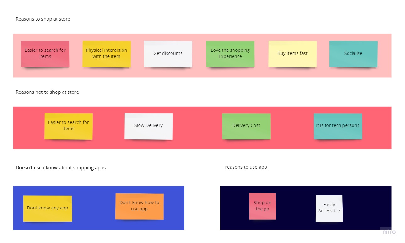
Michaela shops at the physical store and is not aware of existing apps. She enjoys shopping at the store, but there are often too many items and can’t find the perfect ones (price and quality). She may be a potential user of the app since she uses e-commerce websites to shop for furniture and items for her interior design business.
Potential project approaches:
- App Navigation improvement.
- Easy filtering of the products.
- Straightforward checkout and easy payment.
- Possibility of shopping without an account.
Feature Matrix
Using a feature matrix, to come up with various new features that are intended to feature in the MVP (Minimum viable product). Approached the features from the business perspective and organized them according to users’ and businesses’ needs. The features displayed in the top right corner (the red box) should be included in the app.
The Design Iterations
Design
User Flows
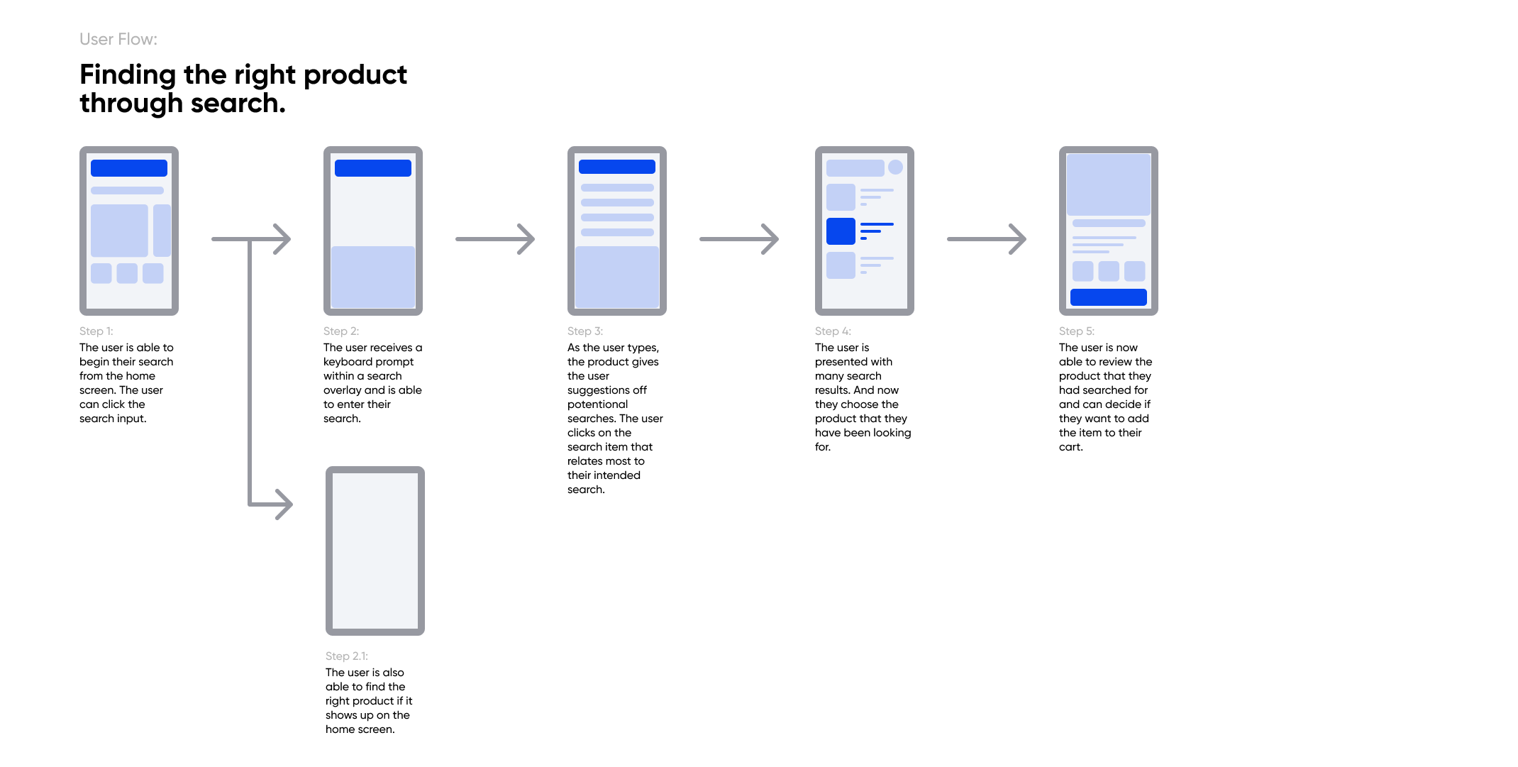
Wireframes
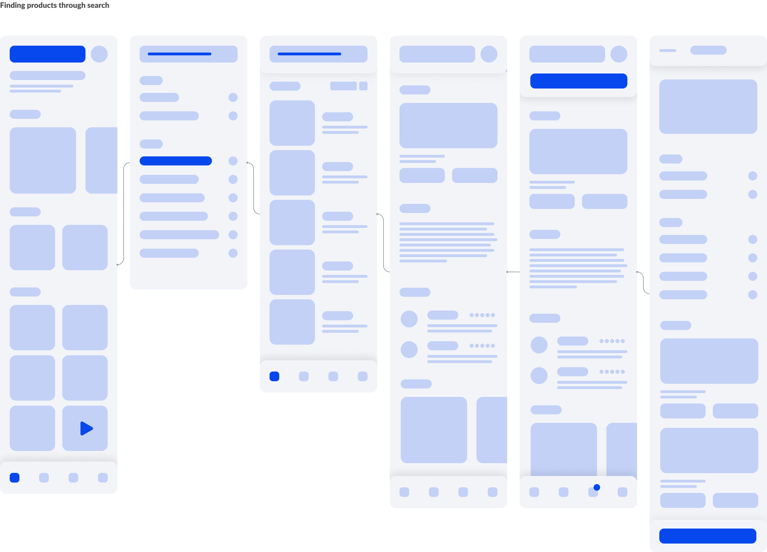
Mockups
Learning Points
1. Moving to digital totally may not always be the best solution. Human touch factor is sometimes important.
Almost all users claimed that they enjoyed speaking to the customer service employees when they need clarifications; the interaction creates meaning to their trip. Customer service employees are irreplaceable as they are still important for helping customers on their clarifications.
2. Understand behavior of the users can sometimes be better than talking to them.
User do not always know what they want. Also, when conducting user interviews, we have to be careful with the choice of words we use and how we present those questions, due to the possibility of forming social desirability bias. Based on user behavior (ethnography), we managed to identify the pain points of the user more successfully than conducting user interviews.
Next Steps
More user interviews and usability testing — Due to the tight deadline of less than 2 weeks. It would have been nice to have more time for user interviews and usability testing.
Adding and Implement Virtual reality so users can see appropriate items and place them in the context they are needed in..